- Research
- Wireframes + Design
- Web Development
 Background
Eliza is a multi-faceted photographer, activist, speaker, and now podcast host. In her photography campaign "Cheer Up Luv," womxn who have experienced street harassment are photographed in a public location & share their experience of public harassment as a means to reclaim the space and spread awareness.
Not only does Eliza continue to produce her photography campaign, but she has also worked on campaigns for some of the world's top brands, on top of speaking at numerous universities and conferences.
Her new website would have to accommodate the many different people visiting her website, while also promoting her newest project: her new podcast.
Primary users of her website include:
- Social media follower: wants to see what Cheer Up Luv is about and is interested in Eliza's other work, such as articles or podcasts. Entry point: Instagram link -> website link.
- Podcast listener: is interested in following Eliza on her social media platforms; wants to reach out to her to submit a story. Entry point: Podcast -> website link.
- Art director for a brand: wants to see Eliza's previous photography work and easily contact her for more information. Entry point: email -> website link OR Instagram link -> website.
- Hiring manager for a school, conference, or event: wants to see Eliza's previous press and resume of talks and easily contact her for more information. Entry point: email -> website link Or Google organic search -> website link.
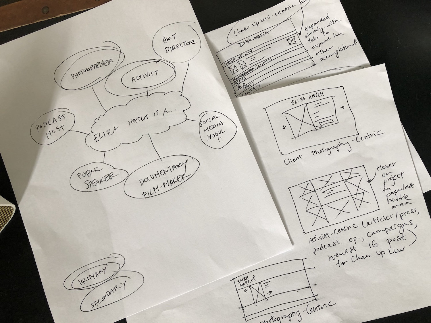
My first sketch session was to explore what the website would look like if it focused on one of Eliza's many roles: client photography-centric, activist-centric, Cheer Up Luv-centric, etc.
Because she has many projects, I wanted to further explore what a combination of her many roles would look like, or where her newest project, whatever format that may be (podcast episode, article, etc.), would be the focus of the homepage.
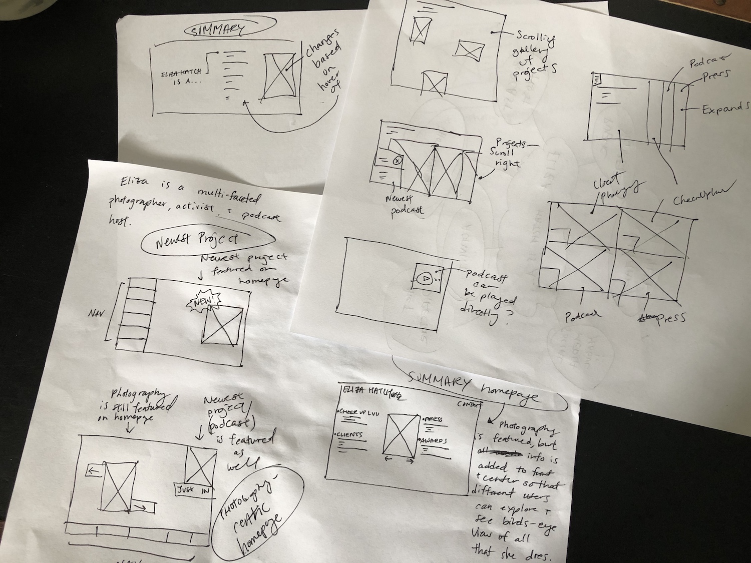
I then narrowed it down to the following three layouts to pitch.
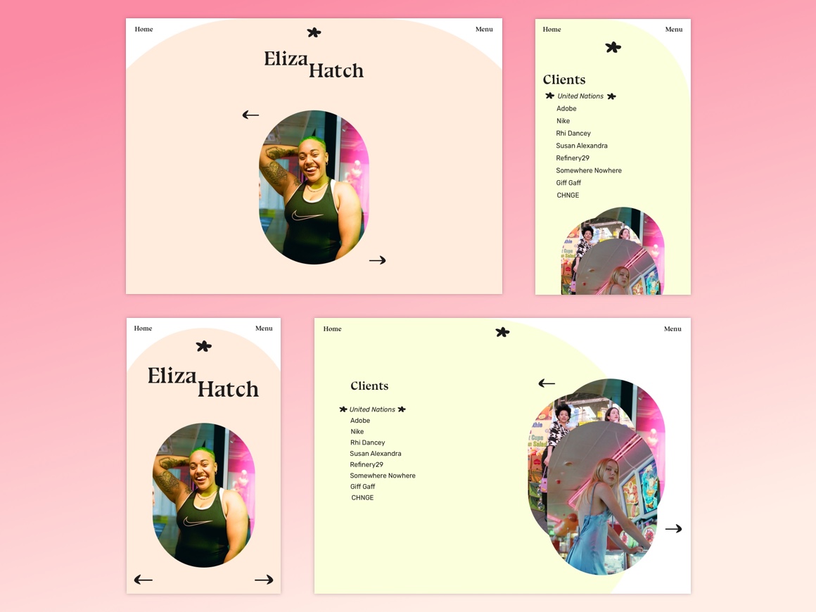
This is the most traditional photography portfolio design, with a manual slideshow featuring clients on the homepage.
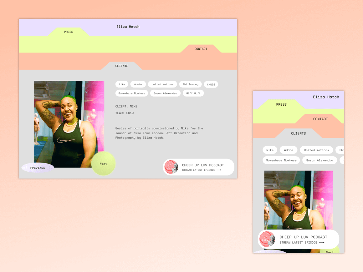
The Clients page slideshow is a bit more experimental, with images being overlaid on top of the previous one each time the user presses Next.
In our kickoff meeting, Eliza pointed to organic shapes and illustrations when asked about website styles that she liked, so custom arrow icons and a flower logo icon were created.
To showcase her newest project, a floating pill is added to the bottom right-hand corner. Her photography is still featured as the default tab, but on mobile, the call to action for the newest project is fixed and shown above the fold.
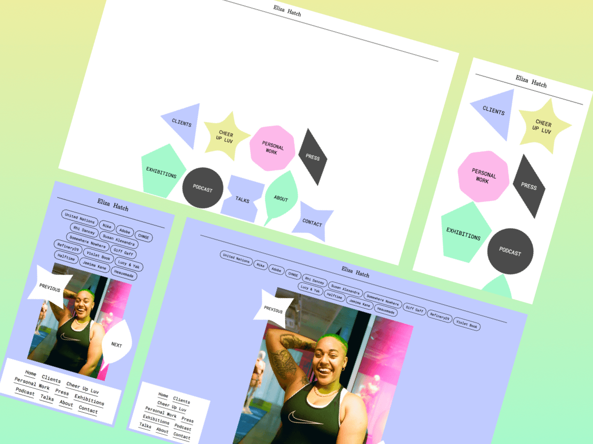
Instead of focusing on one aspect of her talents, all aspects of her projects are pulled into the homepage with playful shapes.
This way, there isn't a centralized focus to her work, and different audiences can find what they are looking for immediately upon visiting her website.
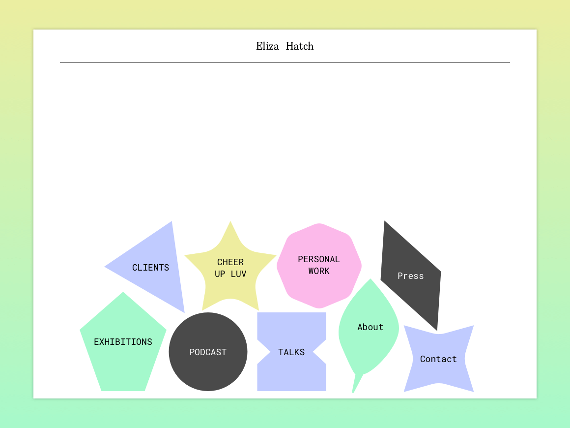
After talking with the client, we decided to move forward with option #3.
Mobile views & features were taken into careful consideration, as Eliza has a large following on her Cheer Up Luv social media account, so many people will be visiting her website through Instagram. (For example, on mobile, the shapes are large, lending to easier clickability, and for the Clients page, the navigation is sticky and at the bottom, easily reachable by thumb on mobile.)
All text and foreground color contrast passes WCAG 2.0 AAA.
A visually hidden "Skip to main navigation" link is shown on tab, and the focus indicator has been styled to be more bold.
Some further accessibility features to consider:
- Page transitions
- Target link size for navigation on mobile should be larger
- Non-auto-rotating photo carousels
