- Research
- Information Architecture
- Wireframes
- Web + Logo Design
In 2020, my home state of Georgia became a key swing state in the U.S. presidential election. This moment — a culmination of years of organizing work by Georgians, and specifically women of color, like Stacey Abrams — marked a critical time to keep this momentum going and move Georgia further to the left.
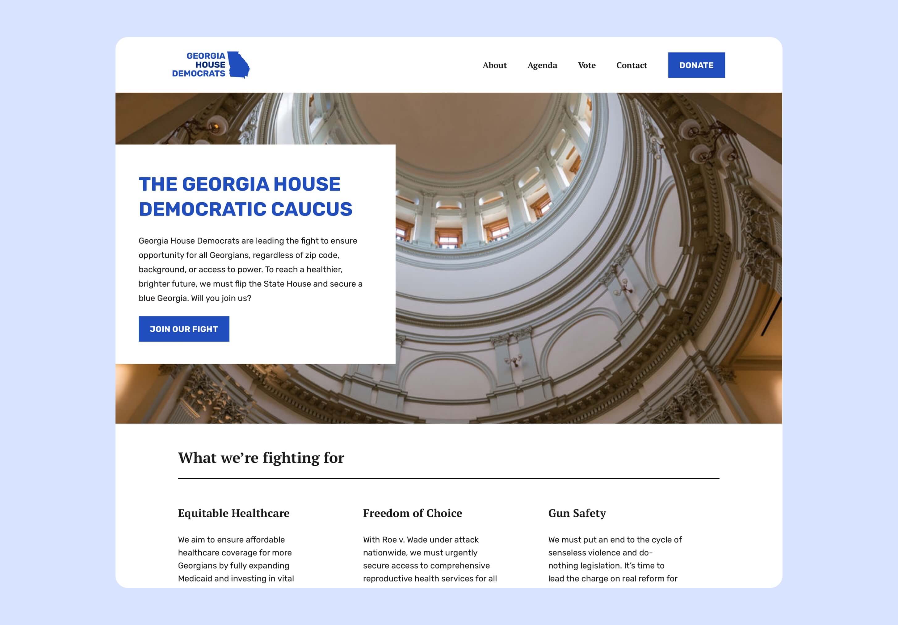
In 2022, I had the opportunity to redesign the Georgia House Democratic Caucus’s website through Tech For Campaigns, an organization that provides pro bono technical & design skills for progressive political campaigns.
After a brief interview process, Tech For Campaigns organized our team, which comprised of:
- A project manager
- A lead copywriter
- A lead engineer
- A lead designer (me)
During our kickoff with the Georgia House Democratic Caucus, we learned that their goals were:
- A fresh, more contemporary look & feel for their website
- A website that helps to accommodate their primary goal of increasing voter turnout
- Increase email captures & make it easier for people to donate (to help aid the goal of increasing voter turnout)
- A new logo that could better work across a variety of digital & physical assets
- Adding ActBlue integration to collect donations
We had 4 weeks to come up with a new website design, copy, Wordpress theme, and logo. 2 weeks were allotted for dev work, so we had a 2-week turnaround time for research and design, with 1 check-in per week with the Caucus to make sure we were going in the right direction.
Because of the time constraints, we had no time for user interviews, but we did collect some information from the Caucus on what their constituents would like to see and what tools are helpful for them.
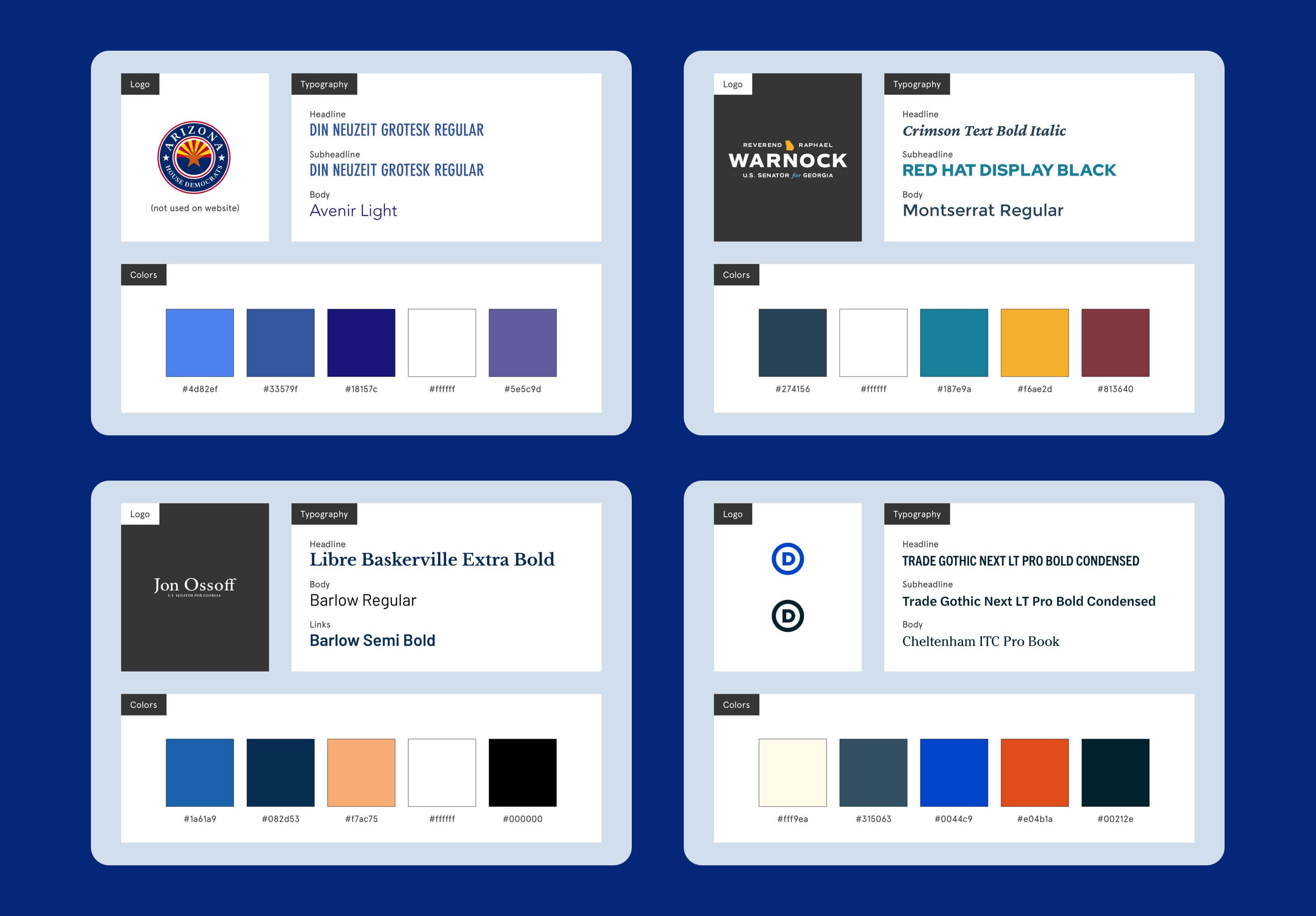
Since designing for a political group was new to me, I wanted to make sure that I understood how other Democratic caucuses and politicians used typefaces, colors, and logos to convey their messaging. We conducted a quick landscape audit of websites & logos, looking to progressive Georgia politicians like Reverend Raphael Warnock and Jon Ossoff.
I also worked with the lead copywriter to reorganize the information architecture. We consolidated similar information to create a more streamlined and user-friendly experience for website visitors.
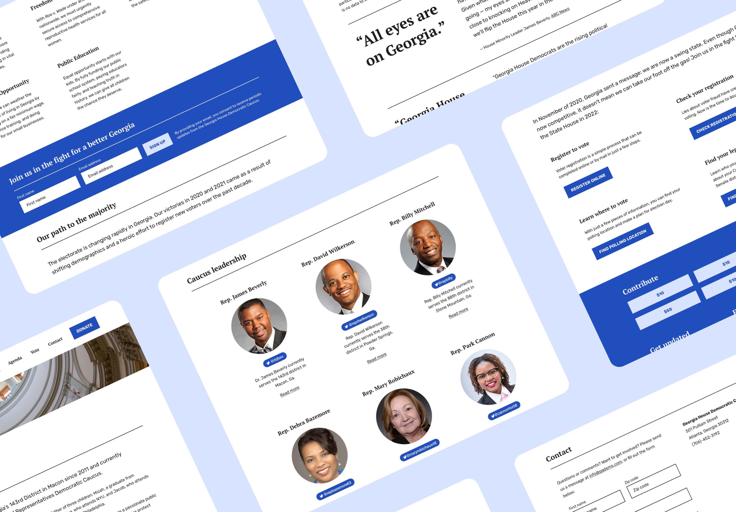
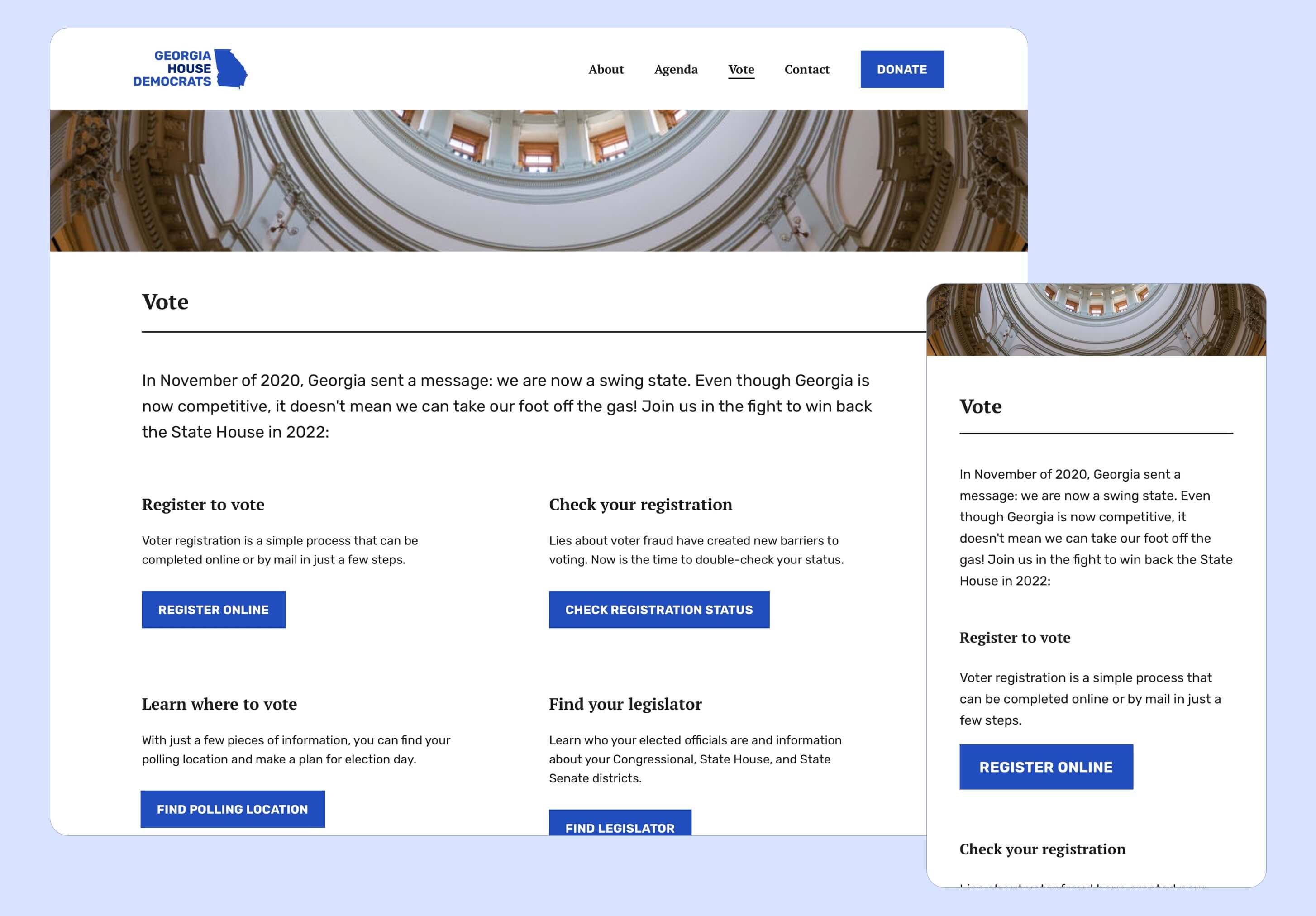
Tools that were important for getting the vote out did not have a strong information scent in the existing website. For example, the “Find your legislator” tool was on the “About” section, after scrolling past all of the Caucus members.
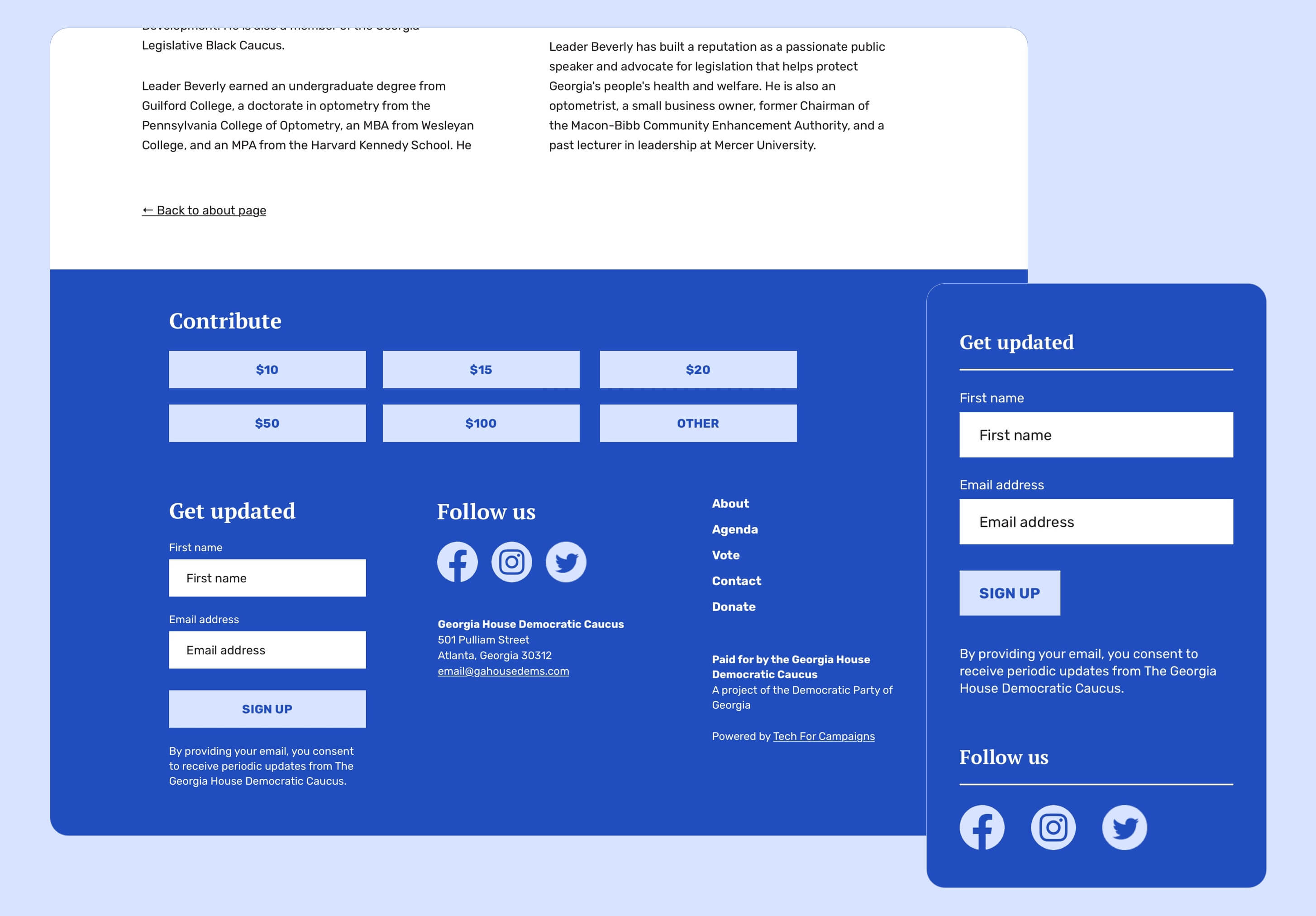
To solve for this, we combined all of the voter resources into a single “Vote” page, with clear, actionable next steps for whatever you might be looking for as a voter.
We also wanted to give opportunities for interested folks to stay informed by signing up for the Caucus newsletter. To do this, we inserted email capture banners into key parts of the website, like the homepage and agenda page.
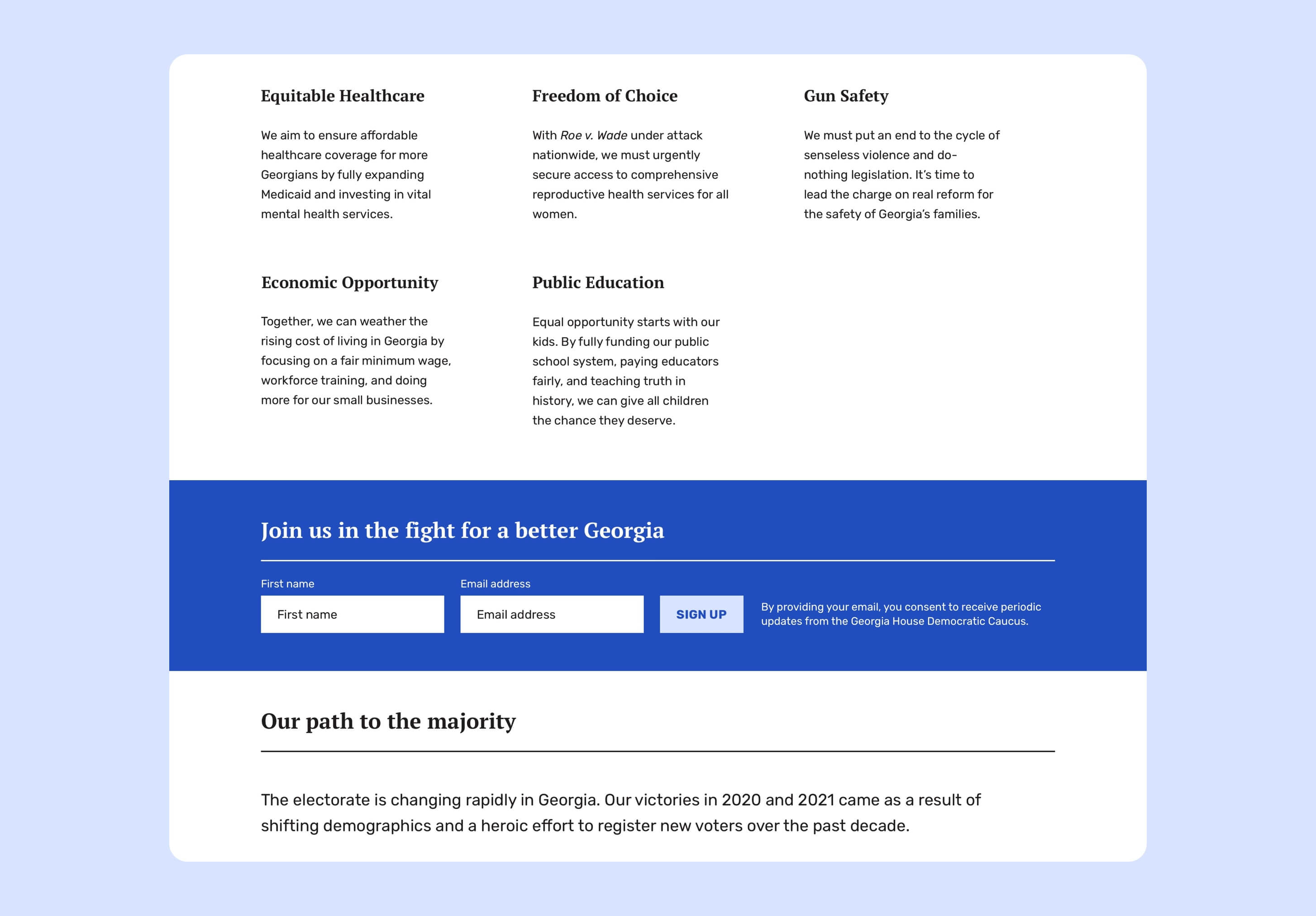
We also added an email sign-up section into the footer, so that if someone is finished reading a particular page, they can decide to contribute or sign up for the newsletter.
Here’s a summary of the goals we considered as we made design decisions:
| 🌟 Goal | 🎨 Design Choice |
| Make it easier to find tools for voting | Add a “Vote” section |
| Make it easier to understand Caucus agenda & values | Consolidate issues and values into a single “Agenda” section |
| Highlight recent press about the Caucus | Add a section on the homepage for “news and press releases” |
| Increase donations | Highlight “Donate” button and add donation widget to footer |
| Increase email captures | Add a sign-up banner to the footer and to high-traffic areas of the website |
Other considerations include:
- Responsive design for desktop, mobile web and tablet visitors
- Web accessibility, ensuring that contrast and other design elements pass AA compliance
- Dev handoff and documentation, to make sure that the engineer on the team has enough context and details for implementing the design
The existing House Democratic Caucus logo was the Democratic Party logo on an outline of the state of Georgia. There were a few variations: a text lockup, an icon, and the icon with a star border.
A few logo pain points:
- The outline and type colors made it tricky to use on many background colors, which limited options for flyers and social media
- For contexts in which the logo must be small in size, the text lockup was often not legible
- The typeface and icon did not fit cohesively with their more modern materials
- The logo could be more visually distinct from the Democratic Party logo
To solve for these pain points, we came up with two options. Both options have a clean and modern feel by using a san serif typeface and updated color pallette.
Option 1 features a highlight text treatment overlaid on a blue Georgia. We have two variations of the logo for light- and dark-colored backgrounds.
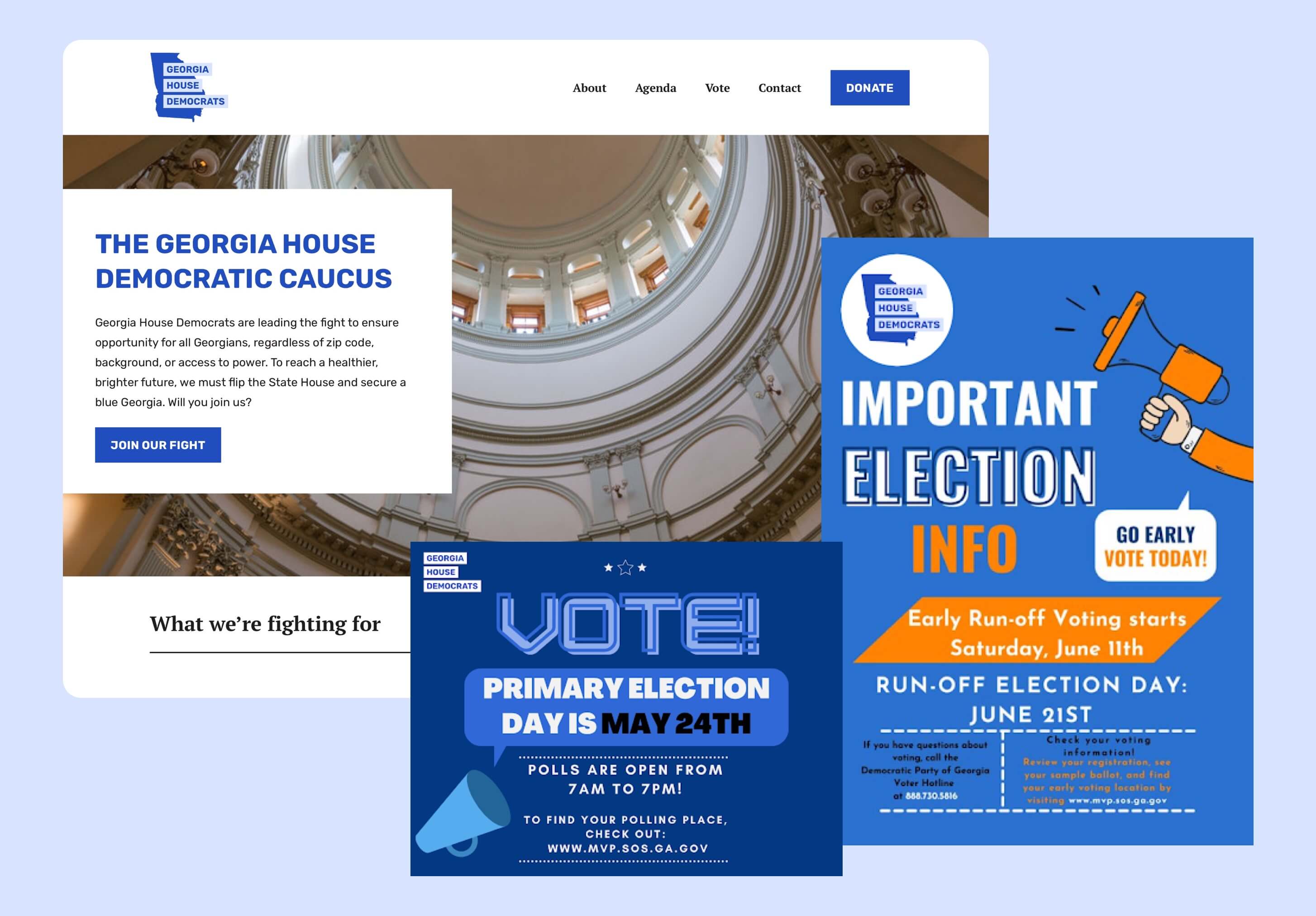
With Option 2, the vertical space and text size is maximized by having the Georgia icon sit directly next to the text. We also played with text colors, ensuring that all colors were AA compliant on light background colors.
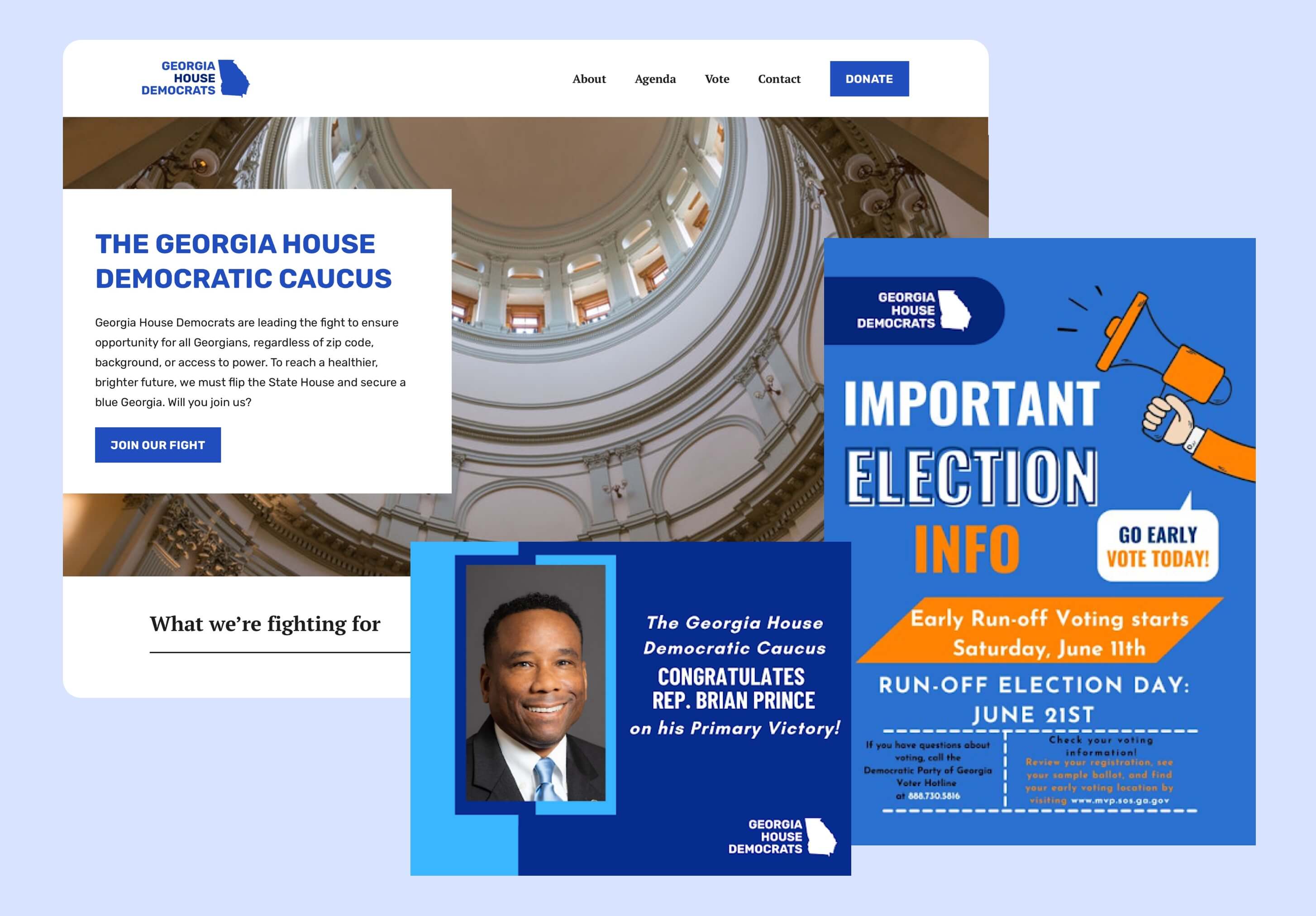
After presenting to the Caucus, they decided to go with Option 2.
Although we had a very short turnaround time for design and had no time to update the look & feel after dev implementation, we finished the site in the timeline allotted.
Having a new logo and colors felt like a good first step given the time constraints. If I had more time, I would have created a brand kit or guidelines to help with social media and other assets.
Overall, the team gave the Democratic Caucus a fresh look, but more importantly, gave Georgians visiting this page actionable ways to learn about the Caucus, vote, and stay informed.