- UX Research
- Brainstorm Session + Sketches
- UI Design
Background
Wunderkind (previously known as BounceX) is a marketing technology startup that provides one-to-one behavioral onsite, email, and SMS customer experiences to eCommerce and publisher clients like Nike, Forever 21, Casper, and Conde Nast.
As an interaction designer, I design new, high-impact end user experiences across our products to increase performance, UX, and client delight, but because of the cross-functional nature of Wunderkind, I've had the opportunity to work on a few internal product design projects.
Case Study
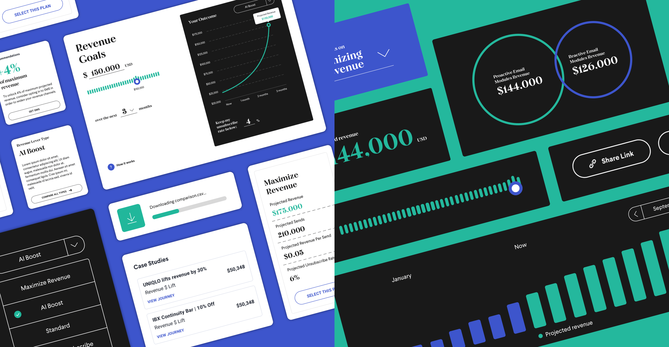
Revenue Lever ToolThe Revenue Lever tool is part of our client-facing software. The goal: let clients set how aggressive or moderate the AI model is for our recommendation email engine, empowering our clients to choose their tradeoffs in a precarious balancing act: on one hand, you have more recommendation emails being sent out to more customers, which means more overall revenue, but it means increasing the unsubscription rate for your email list.
On the other hand, you can choose to focus on minimizing your unsubscribe rate, which means not as much overall revenue, but will retain your subscription list.
User Research
Based on our target users (marketing managers, marketing directors, and marketing VPs of our client companies), I came up with three primary goals for our three different users as North Star for the brainstorming and designs moving forward.
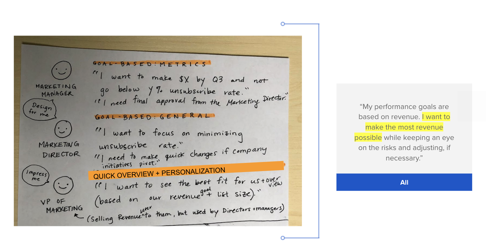
Our internal stakeholders wanted this product to look expensive in order to upsell this feature to current clients by appealing to their VP of Marketing, but the marketing managers and directors are the ones actually using this product, so we had to keep this in mind.
Sketches
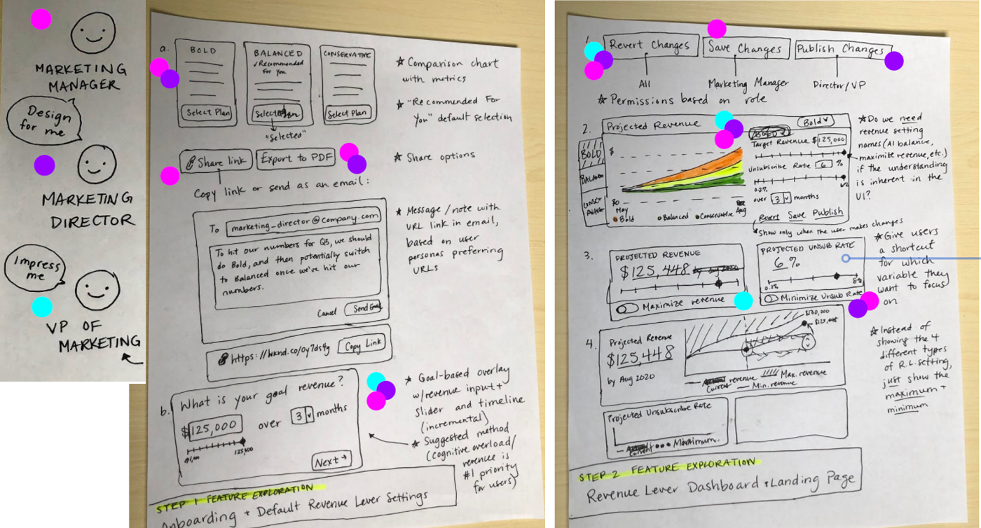
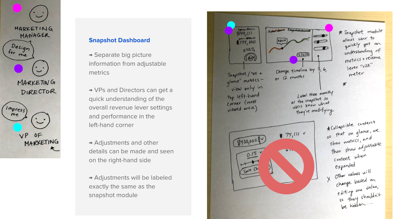
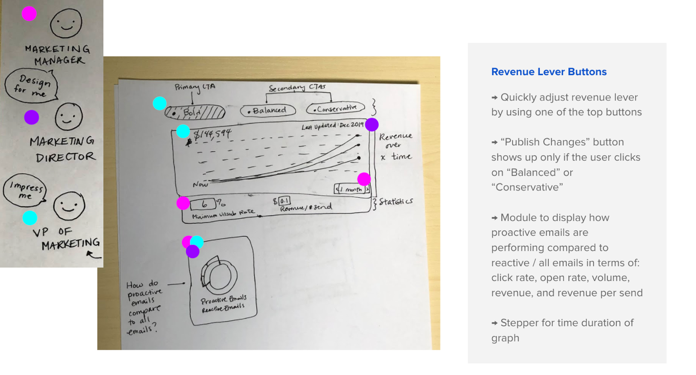
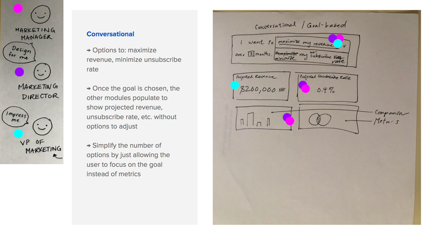
Brainstorming SessionThe first brainstorming session consisted of quick sketches of features that solve for one or more user goals. (The different color dots represent each of the primary users.)
This wasn't super organized; just quick sketches of everything that came to mind so that I could put ideas onto paper.
Sketches
Dashboard OptionsThe next step was to combine features into more fully-formed dashboard options.
------
------
------
Mockups
The next step was to choose the best two dashboard ideas and create mockups.
To encompass two opposite ends of the spectrum that still catered to our users, I chose to move forward with Option 1: Calculator and Option 4: Conversational Modals.
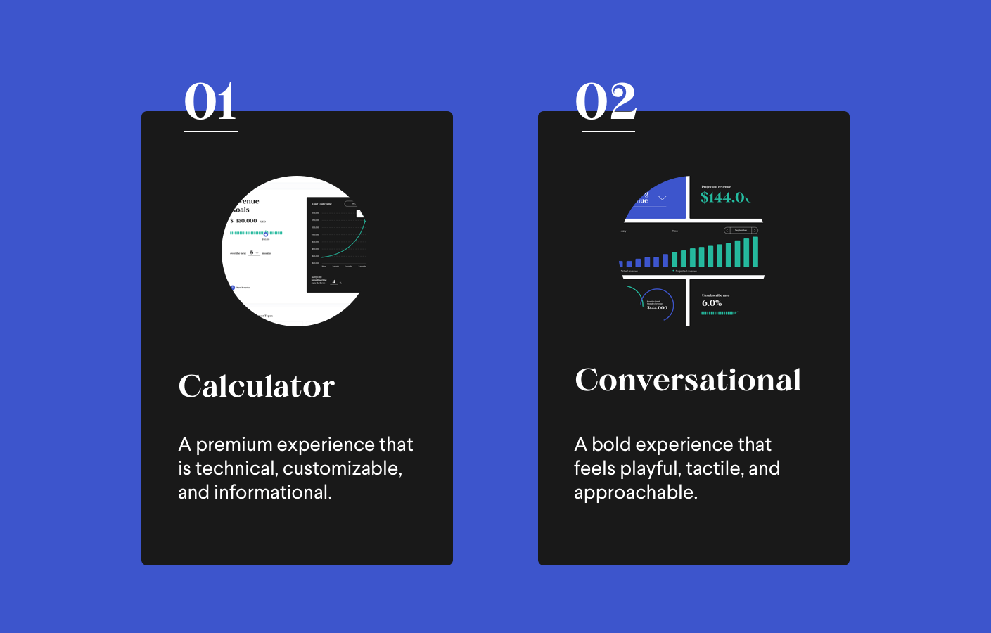
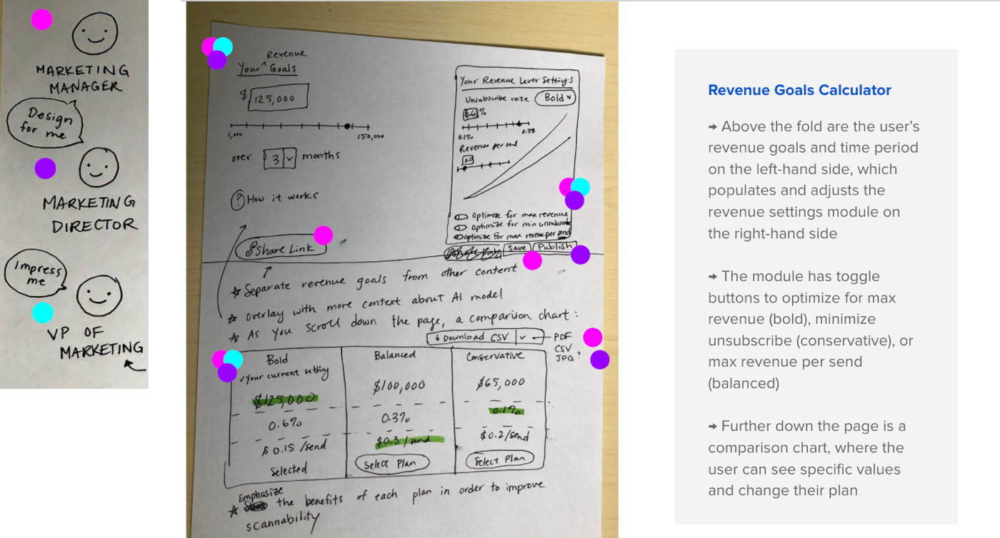
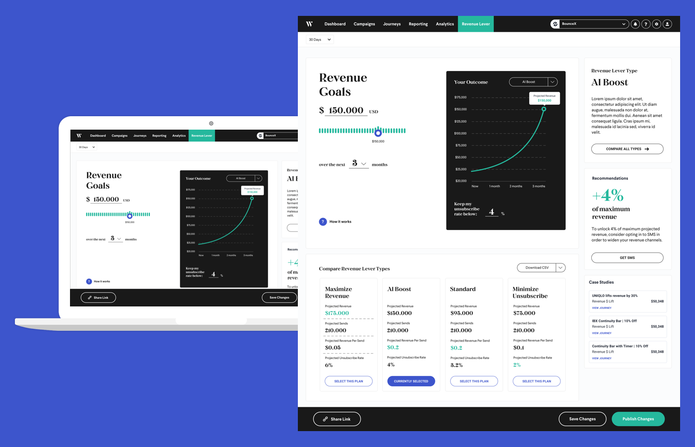
The Calculator gives the user total control over the revenue goal and minimum unsubscribe rate, adjusting all of the details as needed to get to the perfect balance.
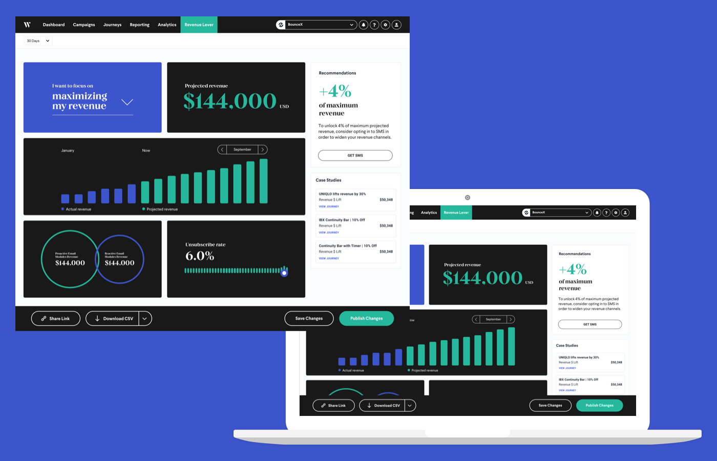
The Conversational Modals focuses on just the primary goal (maximize revenue, minimize unsubscribe rate, or balanced), eliminating the need for tweaking details and allowing the user to focus on the big picture.
Calculator
The user fills in the left-hand revenue goal and time period, and the right-hand graph populates accordingly. Basically, there are a lot of options to change the settings: adjusting the unsubscribe rate, or scrolling further down to a detailed graph of each level.
Conversational
The user chooses the primary goal and then all of the modules adjust accordingly. The user can select the different goals to see the different outcomes, but mostly everything else is informational instead of interactive, save for the unsubscribe rate, which is editable due to stakeholder interviews showing that our users want strict control over unsubscribe rates.
Next Steps
In the end, we realized that we still needed some sort of onboarding experience to start off users on such an ambitious tool, but we found that overall, this was a great exercise for finding a tone that balances bold design and technical acuity.