- User Research
- Wireframes
- Prototype
- User Testing
- Design + Prototype
 Background
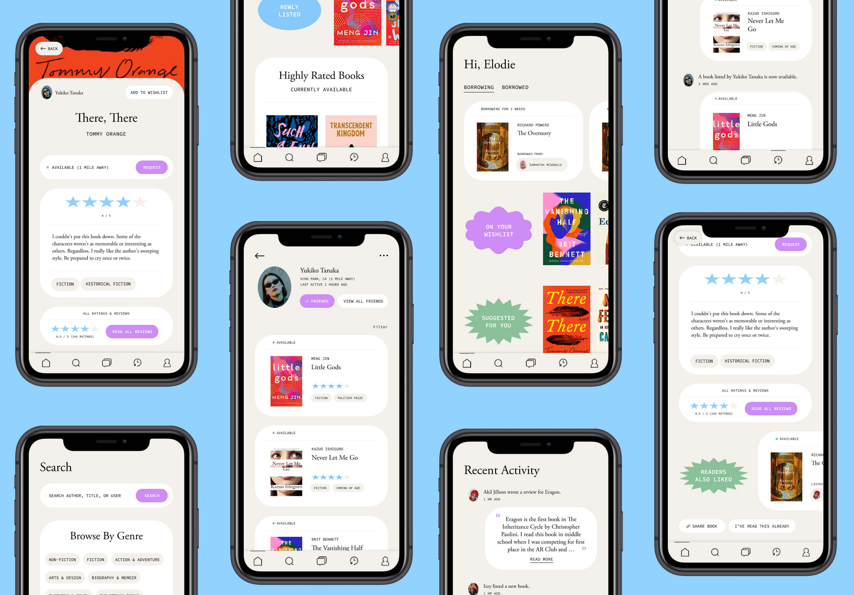
Shelf is a social app for borrowing and lending books amongst your community. It keeps track of who is currently borrowing your books (and what books you're borrowing); shows short book reviews from friends; and lets you create wish lists so that you can get notifications if a book you want to read is newly listed or available.
The goal of Shelf is to introduce a social element to literacy, promote reusing & recycling, and create an opportunity for community-building and community sharing.
| BookMooch | List book(s) you would like to give away, mail book(s) to recipients, then request books you would like to receive. Users must give away a book first before being allowed to request a book. Users can’t borrow or lend. Although the pool of books is much greater with strangers than with friends, there is no social element to the site. |
| Little Free Library (LFL) | Community-building aspect is something to appreciate, but you never know what books will be there (part of the thrill, but not particularly helpful if you're looking for a specific title or author). |
| Public library | Borrow books for a finite period of time. Incur a fee if the book is late, or renew the book. Again, the scope of books is much greater, but there is no social element, and borrowing from friends would (probably) not have a specified due date or renewal requirement. |
| Posting on Facebook or Instagram | Requesting books by posting a status, story, or post. It has the social element, but doesn’t take into account book tracking or browsing. Plus, your post might be buried in a couple of days, with only a short period of time for someone to see. |
In short, there is no social app or website that lets you borrow/lend books with friends.
I surveyed 5 people ages 23 to 65, ranging from casual or occasional readers to avid readers, but mostly focusing on moderate to avid readers. From the 5 people surveyed, some common themes are outlined below (where p1, p2, etc. are the people surveyed):
| Where do you typically get your books? | |||||
|---|---|---|---|---|---|
| P1 | P2 | P3 | P4 | P5 | |
| Amazon | Yes | Yes | Yes | ||
| Local bookstore | Yes | Yes | Yes | Yes | |
| Public library | Yes | Yes | Yes | ||
| LFL | Yes | Yes | Yes | ||
| Secondhand | Yes | Yes |
| What do you base your book purchases on? | |||||
|---|---|---|---|---|---|
| P1 | P2 | P3 | P4 | P5 | |
| Book ratings | Yes | Yes | Yes | Yes | Yes |
| Published book reviews | Yes | Yes | |||
| Suggestions from friends | Yes | Yes | Yes | Yes | |
| Book price | Yes | ||||
| Book looked interesting | Yes | Yes | Yes | Yes | Yes |
| Book is popular | Yes | Yes | Yes | Yes |
I then followed up on a few surveys with casual 1:1 interviews. Some overall takeaways:
- Most people get book suggestions from having conversations with friends. Some people look at Amazon's best-selling books to get ideas, but others had very specific book lists that they trusted (for example, specific staff members on McNally Jackson's Staff Picks).
- Most people will specifically go to Amazon or Goodreads to read reviews even after they get suggestions from friends.
- People find it awkward to ask someone to return a book they borrowed. One person said they found it as an opportunity to be able to meet back up with their friend and discuss the book.
- People own a lot of books they haven't actually read.
Based on the user interviews, I created two main user personas centered around book borrowing and general book purchasing habits:
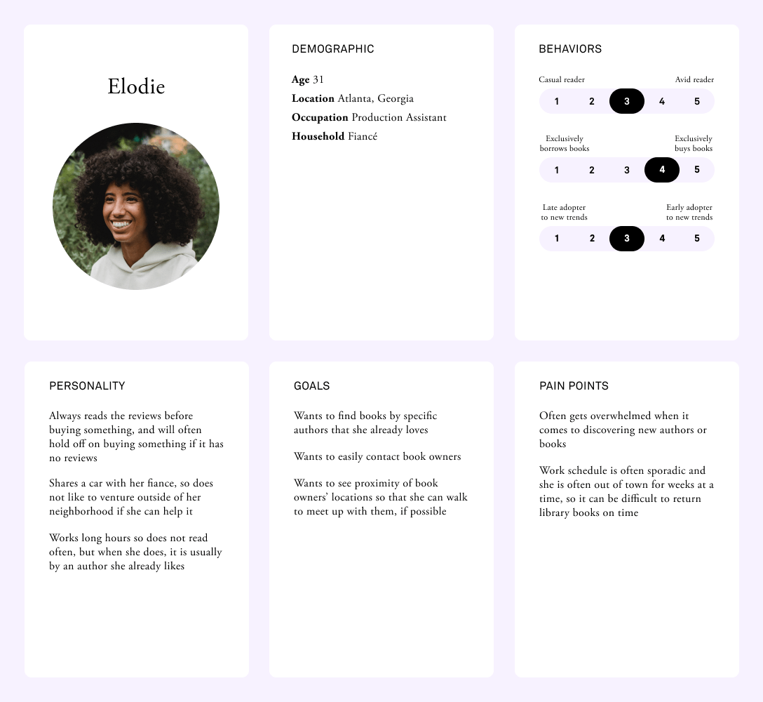
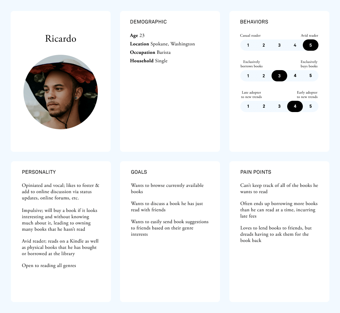
In short, we want to accommodate users who want to quickly use Shelf as a search tool to find a book, and users who want to browse leisurely to discover new books or see what their friends are reading or reviewing.
To figure out all of the features that would be useful to our users, I wrote down pain points on sticky notes and brainstormed features that would help to solve those pain points.
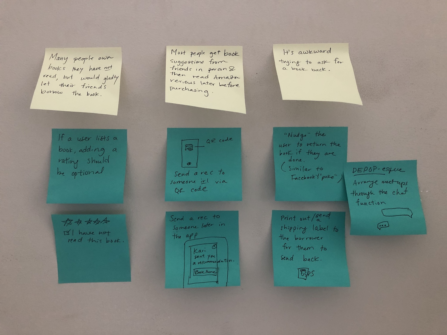
A few feature ideas that resulted from the brainstorm session:
- Have a chat function so that users can arrange to meet up or ask questions about a book.
- Have a feature where users can send recommendations to their friends (either a book they own or not).
- Have a global rating system for each book listed so that people don't have to leave to read Amazon's reviews.
- Have an automatic system notification set for x amount of time to remind users to either return the book or continue reading, to absolve responsibility and awkwardness from the book owner.
- Have a scan function so that users can easily upload many books without having to manually enter the author or book name.
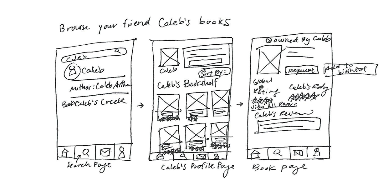
Requesting a book:
| Organic search visitor | Searches for “book sharing app” → enters Shelf website → creates profile to see which friends are on website → browse books of friends → requests book from friend |
| Social media visitor | Clicks friend’s link → enters Shelf website → sees friend’s list of books that can be borrowed → creates a profile in order to borrow book → requests book from friend |
| Direct visitor | Enters Shelf website → logs in → browses books → clicks on a friend → sees friend’s list of books that can be borrowed → requests book from friend |
| Paid advertisement / email | Clicks link → enters Shelf website → creates profile to see which friends are on website → click on a friend → sees friends’ list of books that can be borrowed → requests book from friend |
{} = system options, [] = user actions
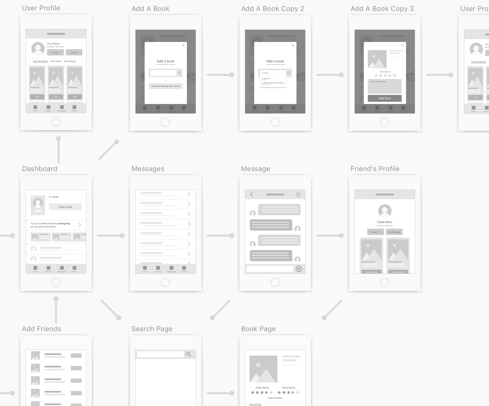
The next step was to create a basic flow diagram of all of the screens that would encompass our app and the relationships between screens.
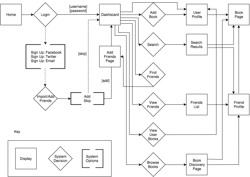
What should the dashboard look like to appeal to both user personas?
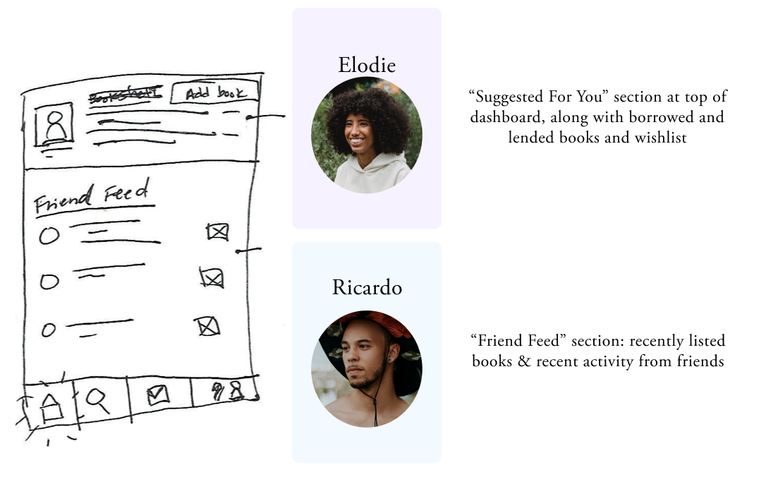
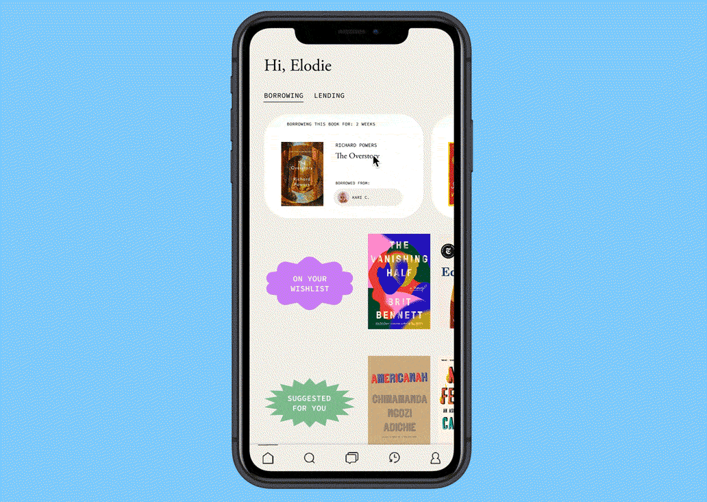
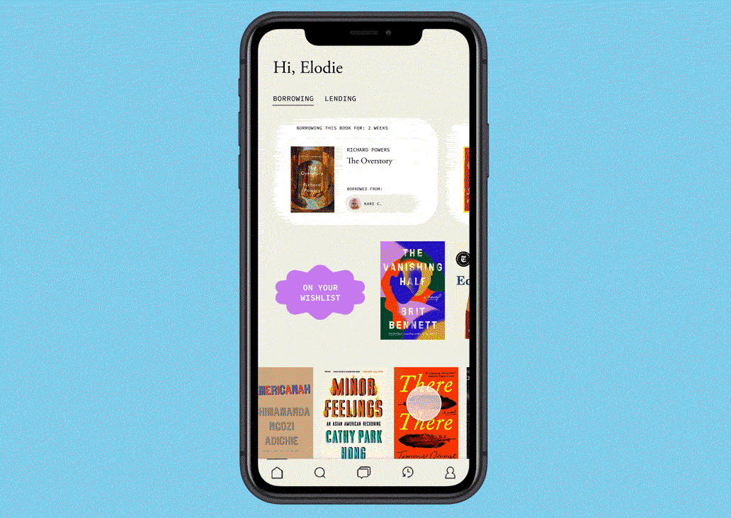
At the top, we have an at-a-glance summary of the user's current books that are borrowed or being borrowed. There's also a CTA for the user to add a book listing, and a "Suggested For You" section, directly influenced by Elodie's pain point of feeling overwhelmed with authors she doesn't know.
Further down, there's a friend feed to show the most recent activity from friends, like what book they just listed or borrowed, directly influenced by Ricardo's desire to leisurely browse the app and see what friends has read what book.
The navigation at the bottom has options of navigating to the search page, messages, and their own profile.
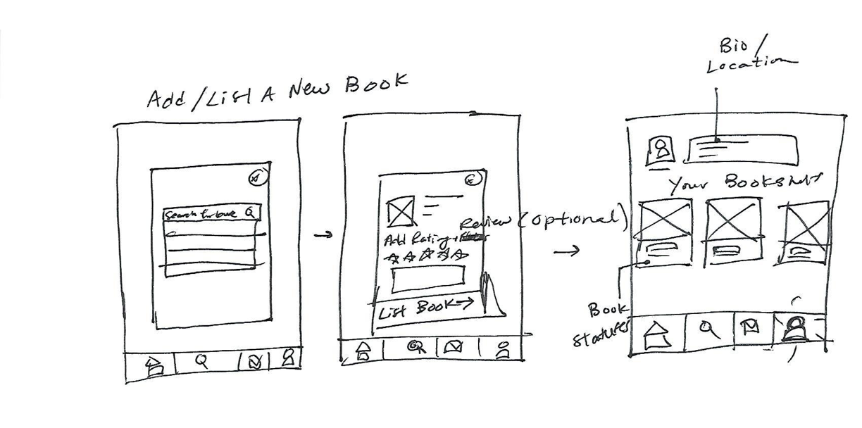
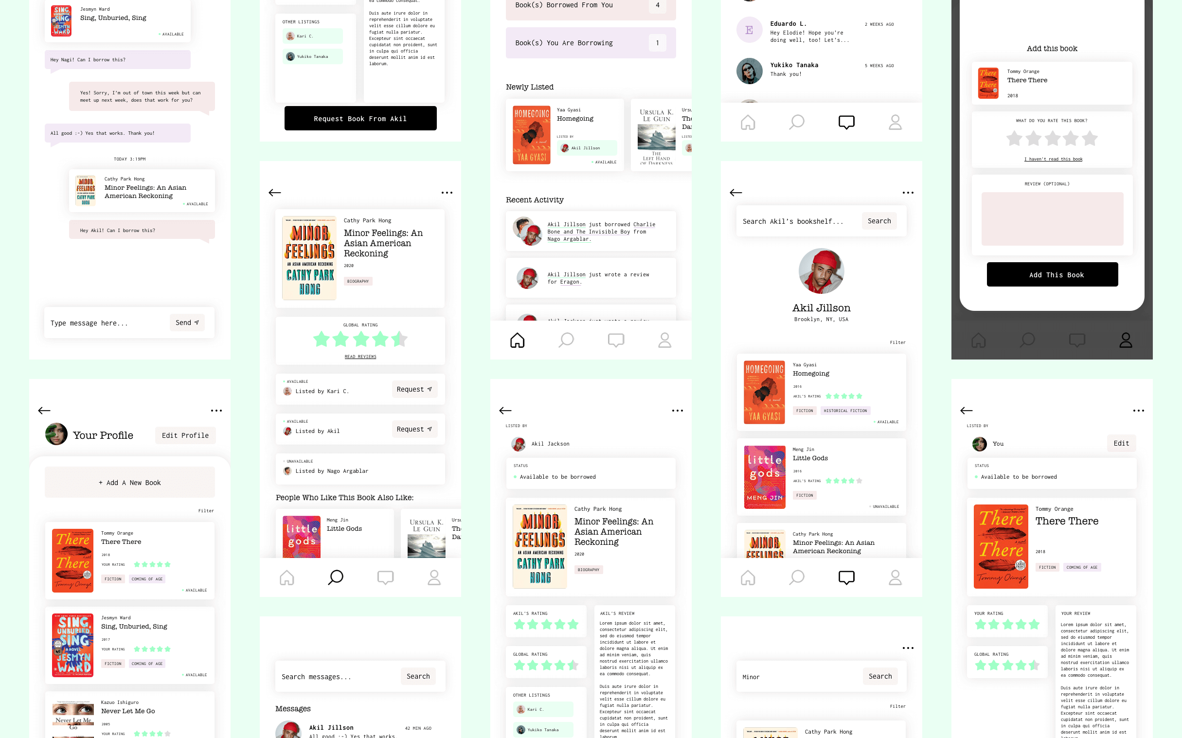
To add a book to be borrowed, a dialog shows an input with autosearch, or the option to use your phone's camera to scan a book barcode. Once the user confirms by clicking on the correct book that is shown based on their search results or book scan, they have the option to rate and add a review to the book that will show up on their profile.
This rating is optional because 1) we don't want users to get hung up on writing something -- they can always add in a review later, and 2) according to our user interviews, people own a lot of books they don't actually read, so some people might not have read the book they're listing.
Once the book listing is confirmed, the user is taken to their profile page, which shows the listed book as the first book on their profile.
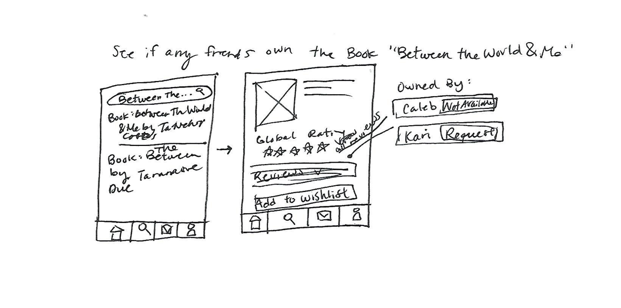
After the user searches for a book, they are taken to the book page. Because of the user interviews showing that most people want to read reviews, a global review rating is shown, as well as a friend review rating, so that they can see both.
The book page displays all of the friends who have the book listed and the current status (borrowed, available, etc.) and if available, the user can easily request by clicking the "Request" button.
The request button then autopopulates a message to the friend that is modifiable before sending.
The user can either search for a friend's name or go to their profile page to see a list of friends.
On a friend's profile page, their list of books are shown, which can be sorted by availability, user rating, global rating, or recently listed; or filtered by genre or rating.
After all of the sketches were finalized and explored and I got user feedback on wording (List a book? Add a book?), I created the wireframes. This process helped me see the entire scope of the project and play around with layout, although you'll see in the next section that the layout changes after a couple of rounds of edits.
When wireframing the dashboard page, adding the Activity Feed started to look like an overwhelming amount of content; the Recent Activity feed distracted from the more pertinent features, such as borrowed / borrowing books. Also, people are used to activity feeds being in a separate menu tab (Instagram, Twitter, etc.), so their mental models of social media apps may expect the Activity feed to be in a separate tab anyway.
Therefore, I decided to abstract the Activity Feed and add it as a separate tab in the menu, rather than on the dashboard.
I decided to create a high-fidelity prototype using InVision in order to make the usability testing participants feel like they are using a real app.
In my experience, when presenting low-fidelity wireframes and prototypes to clients or internal stakeholders, I've found that not everyone can take the mental leap of imagining low-fidelity designs as a real product, which is why I think the usability testing prototypes should have some level of believability with fidelity.
I didn't spend a ton of time here because the purpose was not to focus on the visual design elements, but rather the functionality, layout, and flow.
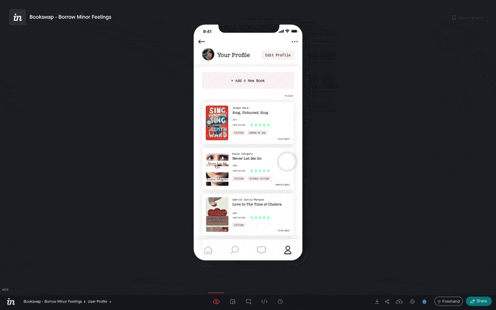
I created a script and conducted usability testing one just one person for 3 different scenarios: (1) listing a book, (2) finding a particular book, and (3) finding a particular book knowing your friend purchased it a few months ago.
Despite testing on only one person, I got some great insights into how I could improve the final design. The most impactful takeaways are listed in the insights table below:
| Task | Passed? | Path | Observation(s) | Solution(s) |
|---|---|---|---|---|
| List a new book | Yes | Profile → Add Book | User was easily able to find the "Add Book" section on their profile page. The add book flow was intuitive. Confusion once the book was added: "Now it's telling me that it's posted... is it telling me that?" | Add a confirmation dialog after adding a book |
| Find and request to borrow the book "Minor Feelings" by Cathy Park Hong | Yes | Search → Book → Went back to search results → Book → Request Book | Likes the automated message function when borrowing a book. "I'd like to see other people's reviews on that [book], how quickly they respond, response time... that would determine my decision on who to choose." | Add average response times to user profiles |
| Find and request to borrow the book "Minor Feelings" by Cathy Park Hong knowing that your friend Akil had bought it a couple months ago. | Yes | User profile → Following → Akil's profile → Book → Request Book | "Is there a friend's list or something?" Goes to the user profile to find a friend list. Had trouble with the follower / following lists — was looking instead for the word "Contacts" or "Friends." "I like that it does everything for me." | Change following / followers to be one single friends list |
At the end of the session, I asked the participant if they had any questions or comments on anything they just did, and got even more great feedback:
| Wrap-Up Observations | Wrap-Up Solution(s) |
|---|---|
| "I'm assuming these would be people in my area... although I'm guessing people can send through mail?" "Look at people near you option within however many miles so that you can pick it up if you don't feel like sending it." Would only meet up with friends or a friend of a friend. | Add radius / "miles away" to user profiles and/or filter by radius / location |
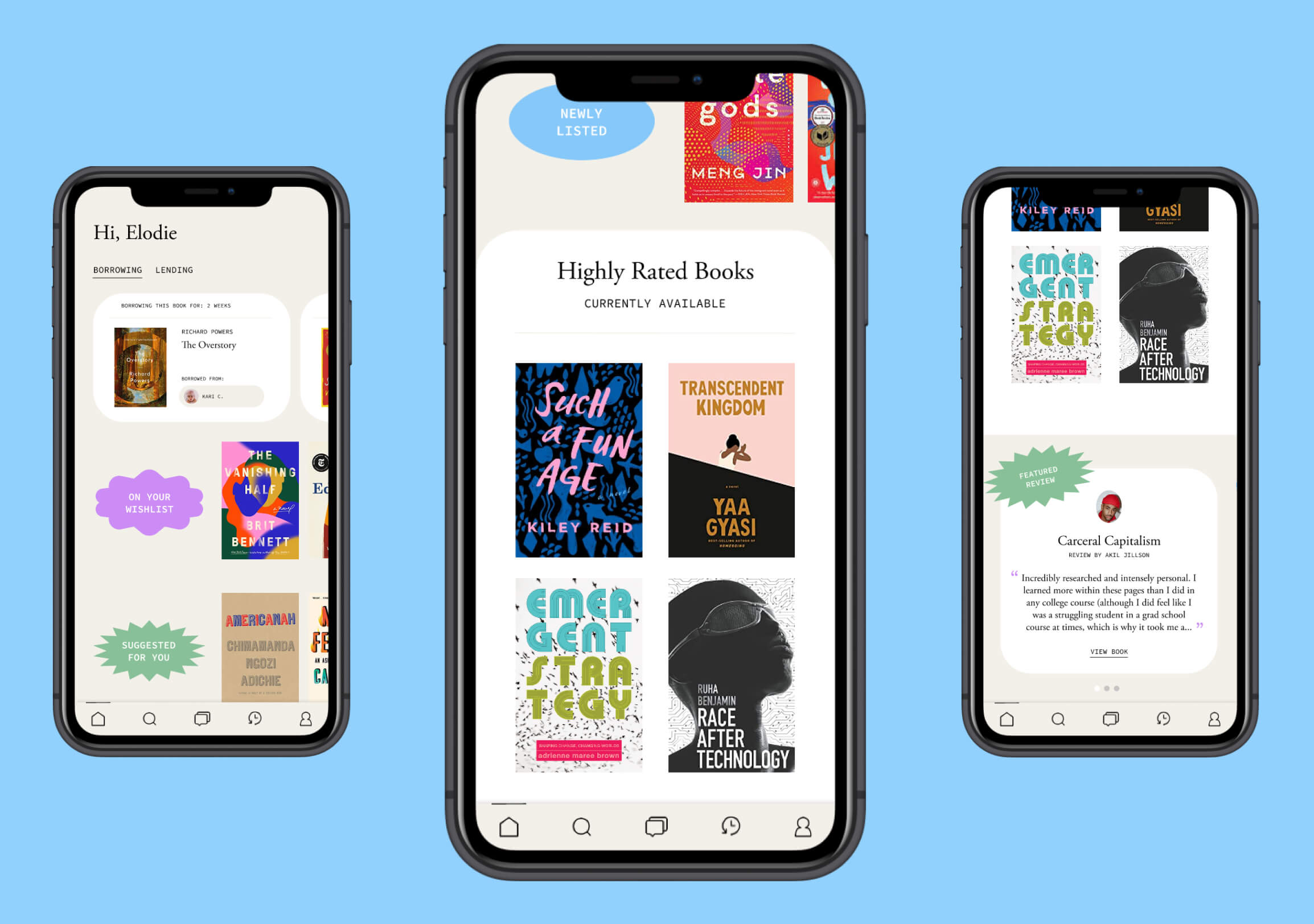
From the dashboard, you can see the books you're borrowing, and use the tab menu to see books you're lending to friends. Further down are book exploration categories (similar to Netflix) to guide the user towards available books that may be of interest based on their previous ratings and readings.
There's also a featured books section that shows generally high-rated books. This section could evolve to showcase, for example, Black authors for Black History Month or Juneteenth; AAPI authors for AAPI Month; or other relevant readings based on events.
The last section includes cards featuring community member-centered reviews.
Final Design & Prototype: book page
The book page displays a large cover image with most of the content showing as you scroll further down. Here, you can see that the availability is shown along with the number of miles away that the lister lives from the user, a direct feature from the usability tests.
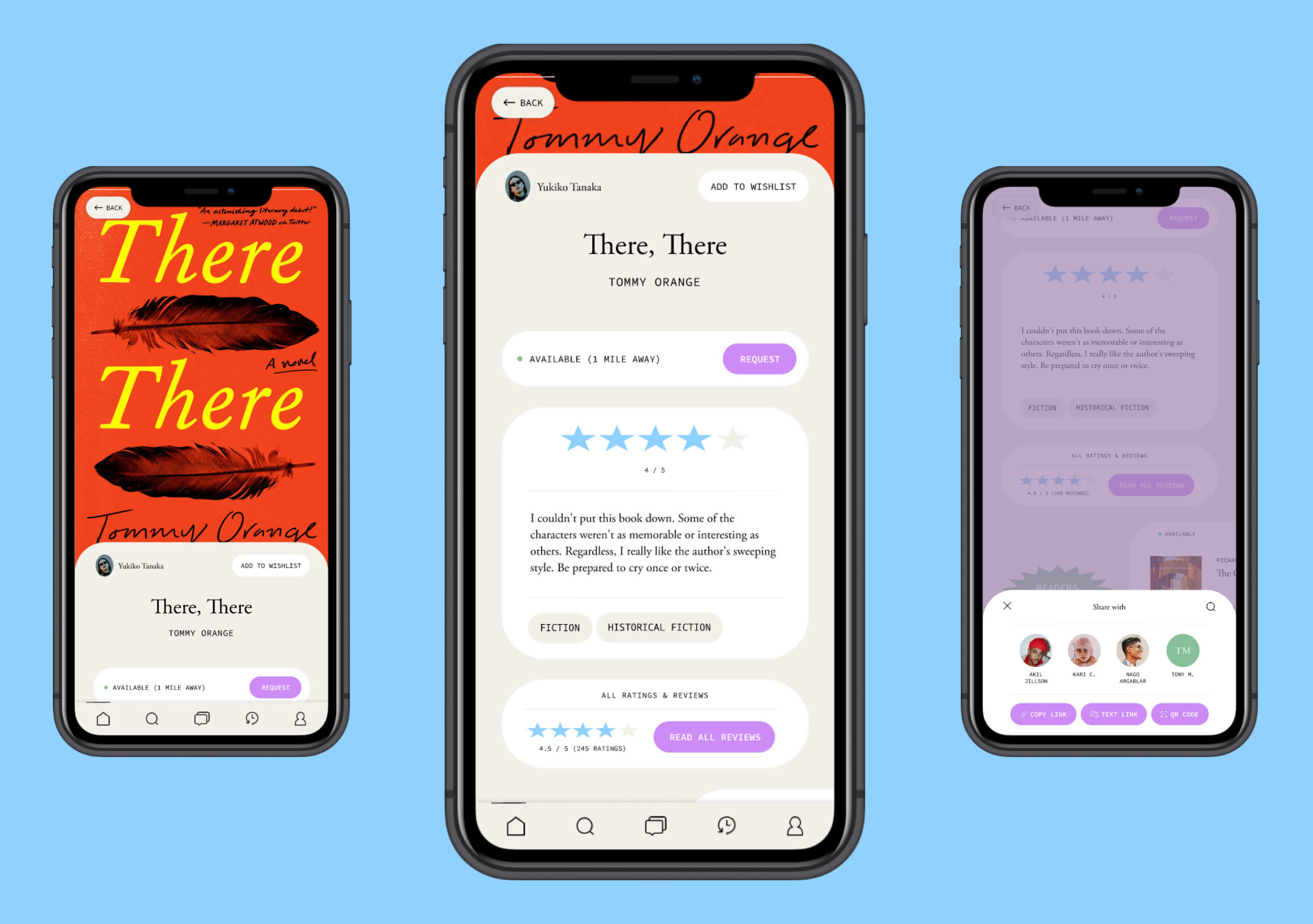
There are options to request the book, add the book to their wishlist, read more reviews of the book, and browse other similar books.
There's also an option to share the listing, which opens up a bottom modal that shows the top people interacted within the app, along with a search button and other ways to share the link.
Initially, I created the wireframes and high-fidelity wireframes in Sketch and then exported them to create the Invision prototype that I used for usability testing, but after redoing the UI design and wanting more robust prototyping features for the next usability testing session, I should have just done everything within Figma.
Overall, I'm happy at how this project turned out. The next step is to do more user testing on the new design!